In 2025, at Chic Refuge, we’re excited to share insights from our extensive background in interior design and styling by exploring seven trending exterior house color schemes that beautifully fuse modern trends with timeless flair.
First, warm earth tones invite tranquility, while cool coastal hues spark seaside vibes. Bold dark accents create striking contrast against lighter shades, and soft pastel tones evoke a serene atmosphere.
Vibrant jewel tones express individuality, while classic neutral combinations offer versatility.
Finally, nature-inspired greens rejuvenate exteriors with their calming essence.
By choosing the right colors, we can enhance our homes’ curb appeal and reflect personal style, setting the tone for an inviting atmosphere.
Let’s uncover even more impactful choices together!
Key Takeaways
- Nature-inspired colors like warm earth tones and cool coastal hues create serene and rejuvenating home exteriors.
- Vibrant jewel tones express individuality, while soft pastels evoke tranquility and comfort.
- Classic neutral combinations, such as soft beiges and light grays, offer timeless elegance and versatility.
- Bold dark accents provide striking contrast, enhancing architectural features and overall aesthetic.
- Trending shades for 2025 include nature-inspired greens, earthy browns, and muted palettes for a sophisticated look.
Warm Earth Tones
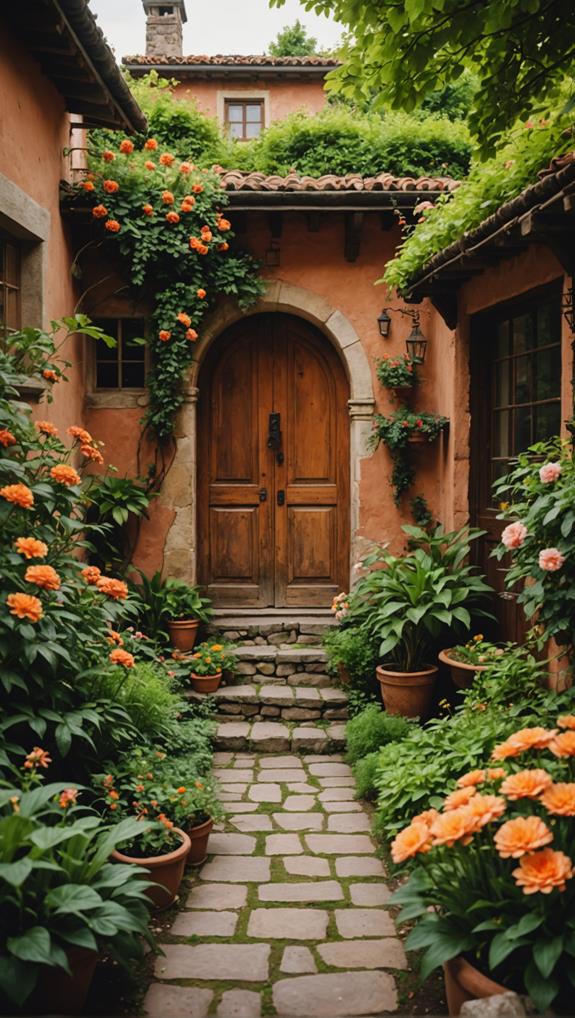
As we embrace the changing seasons of 2025, warm earth tones become a popular choice for exterior house colors. These hues resonate with nature, creating a serene and inviting atmosphere. By opting for colors inspired by the landscape, like rich browns and soft rusts, we foster a connection to the environment.
One striking combination we can consider is pairing terra cotta textures with rustic wood finishes. The warm, reddish-brown shades of terra cotta evoke warmth and comfort, while rustic wood finishes—think deep, weathered greys or browns—add depth and character. Together, these elements create an appealing aesthetic that feels both timeless and fresh.
When selecting paint or stain, we should keep durability in mind; quality products guarantee our exterior looks stunning year after year. It’s also an opportunity for us to reflect on our personal style. Whether we choose lighter shades that brighten the home or deeper tones that anchor the space, the key is to create a cohesive look with our surroundings.
This 2025, let’s embrace warm earth tones to enrich our homes and lives, reflecting the beauty and warmth of nature right at our doorstep.
Cool Coastal Hues
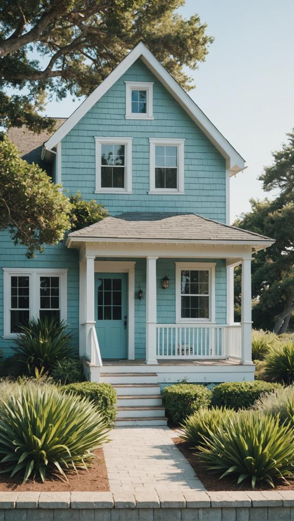
While warm earth tones connect us with nature, cool coastal hues offer a revitalizing escape that evokes the tranquil beauty of the sea.
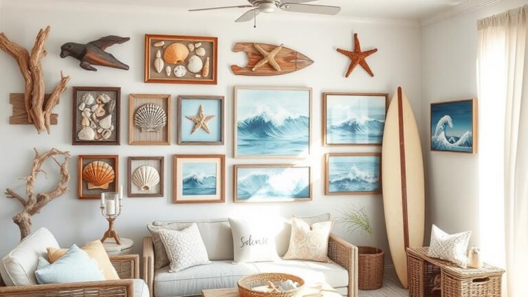
These colors, inspired by ocean vistas and sandy shores, bring a sense of seaside serenity to our homes. We can embrace beachy vibes by selecting soft blues, warm whites, and light grays that reflect the soothing palette of coastal landscapes.
By incorporating ocean inspiration into our exterior choices, we create a calm, inviting atmosphere. Nautical flair can be added through accent colors like deep navy or coral, which enhance the overall look while maintaining that coastal chic essence.
For those who adore surf style, pairing lighter shades with natural textures—like wood and stone—creates a harmonious balance that mimics the shore. Soft sand tones can serve as a perfect base, setting the stage for vibrancy without overwhelming the senses.
In 2025, let’s consider these cool coastal hues for our homes. They promise to elevate our living spaces with invigorating energy and timeless beauty, reminding us of sunny days by the ocean.
Together, we can enjoy an environment that feels like a retreat every day.
Bold Dark Accents
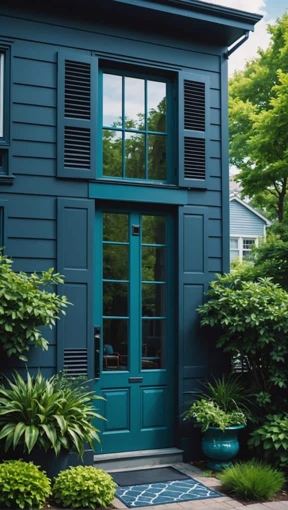
After soaking in the tranquility of cool coastal hues, we can add a striking contrast to our exteriors with bold dark accents.
These dark elements elevate our home’s aesthetic, creating an eye-catching blend with lighter tones. One popular choice is mystical black, which imparts an air of sophistication while grounding the overall look of our property.
Incorporating bold dark accents can be as simple as painting our front door in a deep ebony or using charcoal trim on windows and eaves. This approach allows us to define architectural features and draw the eye, making our spaces feel more inviting.
Pairing mystical black with soft whites or muted grays releases stunning visual interest, providing that essential balance between light and dark.
Additionally, we might consider using dark accents on outdoor furniture or landscaping elements, like fences and planters. These choices not only enhance our garden’s beauty but also create a cohesive look across the property.
Ultimately, embracing bold dark accents is a fantastic way to refresh our home’s exterior, giving it a modern edge that stands out in any neighborhood.
Let’s harness these striking contrasts to showcase our unique style!
Soft Pastel Shades
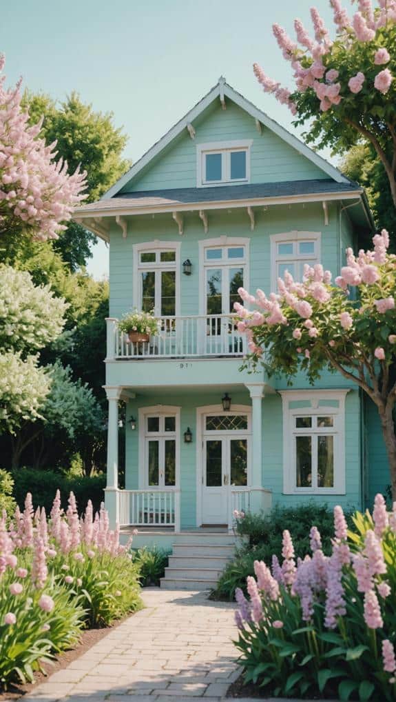
What better way to embrace the charm of our home’s exterior than by opting for soft pastel shades? These colors can transform any facade, bringing warmth and serenity to our living spaces.
Soft pastel palettes, such as gentle pinks, buttery yellows, and mint greens, invite a calm aura that enhances curb appeal while fostering a relaxed atmosphere.
When we choose pastel shades, we’re also embracing pastel color psychology, which suggests these hues evoke feelings of tranquility and comfort. This emotional connection can’t only elevate our home’s aesthetics but also create a welcoming environment for family and friends alike.
It’s worth considering how these colors interact with our landscape. We can use soft pastels to complement natural elements like lush greenery and blooming flowers, resulting in a cohesive look all year round.
For our front door, consider a deeper pastel to make a subtle statement while still aligning with the overall color scheme.
Vibrant Jewel Tones
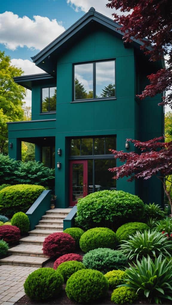
Embracing vibrant jewel tones can truly transform our home’s exterior into a bold statement of personality and style. Colors like emerald green, sapphire blue, and ruby red not only captivate the eye but also evoke specific emotional responses, thanks to jewel tone psychology.
These rich hues can create a welcoming atmosphere, while also making our homes stand out in the neighborhood.
When we choose to paint our exteriors in these vivid colors, we’re not just making a visual choice; we’re also expressing our uniqueness.
We can pair these striking shades with modern jewel accents, like metallic hardware or sleek lighting fixtures, to enhance our home’s overall aesthetic. For instance, an emerald green door framed by brushed gold fixtures can create a stunning focal point.
It’s essential to balance these bold colors with appropriate landscaping and outdoor décor.
Softening elements such as greenery or neutral furniture can help prevent overwhelming our space.
As we explore vibrant jewel tones, we realize that they don’t just beautify our homes; they can also reflect our personality, making our exteriors a true extension of who we are.
Let’s dare to be bold and celebrate our individuality through color!
Classic Neutral Combinations
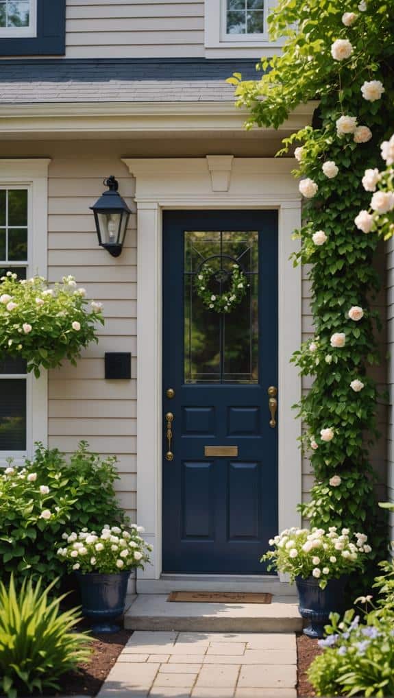
Classic neutral combinations offer timeless elegance and versatility for our home’s exterior. By choosing these shades, we create a foundation that complements any style while allowing for modern updates that keep our homes fresh.
Neutral colors can be warm or cool, giving us various options to express our preferences. Here are some combinations to reflect upon:
- Soft beige with crisp white trim
- Warm taupe paired with deep charcoal accents
- Light gray paired with a bold navy door
- Creamy off-white with rich brown shingles
These classic combinations not only stand the test of time but also provide a backdrop for unique design elements, like new architecture or landscaping. We can easily blend these colors into our neighborhoods, and using neutrals lets us infuse a touch of sophistication.
As we focus on enhancing curb appeal, we shouldn’t underestimate how these colors work together harmoniously. Each combination tells a story while remaining effortlessly stylish.
When planning our next exterior update, let’s keep in mind that classic neutral palettes can elevate our space, balancing the old and the new, making our homes feel inviting and chic.
Nature-Inspired Greens
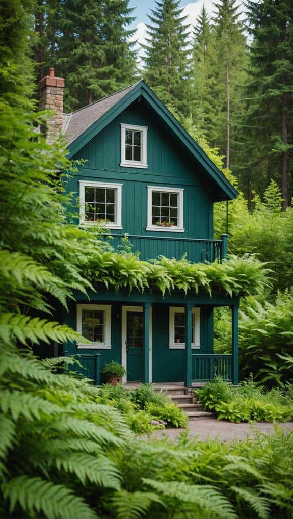
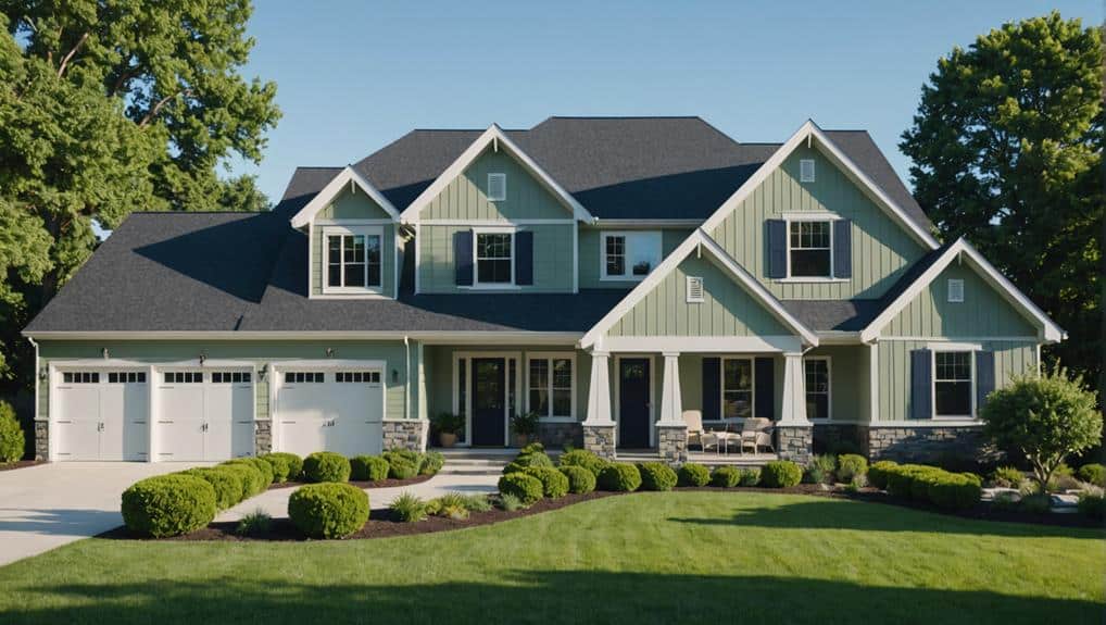
Often, we find ourselves drawn to nature for inspiration when selecting exterior colors. Nature-inspired greens bring a revitalizing allure that can transform our homes into serene retreats. By incorporating forest hues, we can evoke feelings of tranquility and connection to the outdoors.
Imagine a deep, rich green that mimics the shade of moss-covered trees, creating a calming backdrop for our living spaces.
Choosing botanical themes allows us to explore lighter, vibrant greens that reflect the beauty of freshly sprouted leaves and blooming plants. This palette not only reinvigorates our home’s exterior but also enhances curb appeal, making it inviting to guests and passersby alike.
To achieve a harmonious look, we can pair these greens with complementary neutrals or earthy tones. For example, combining a muted sage with warm beige trim can balance the boldness of a forest green door, creating a sophisticated yet approachable vibe.
As we think about our exterior color choices, let’s remember that nature-inspired greens can establish a connection between our homes and the environment, infusing our living spaces with life and energy.
This year, let’s embrace the beauty of nature right at our doorstep.
Frequently Asked Questions
How Do I Choose the Right Color Scheme for My Home’s Architectural Style?
When we choose a color scheme for our home’s architectural style, we consider color psychology and architectural harmony. By blending these elements, we create a cohesive look that resonates with both us and our surroundings.
Will These Color Trends Adapt Well to Different Climates or Regions?
As we explore color choices, we can’t ignore climate considerations. Those bold hues might thrive in warm regions, while subtle tones fit cooler areas perfectly. Adapting our palette guarantees harmony with our environment. Let’s discover!
What Exterior Paint Brand Offers the Best Durability for These Color Schemes?
When we consider exterior paint brands, we love those known for paint longevity and resistance to color fade. Brands like Benjamin Moore or Sherwin-Williams consistently deliver durability, ensuring our homes look vibrant for years.
Can I Combine Multiple Color Schemes on One House Exterior?
Absolutely, we can create a stunning exterior by blending color combinations. Imagine a sunset sky—this harmony promotes visual balance. We should carefully choose shades that complement rather than clash, ensuring our home stands out beautifully.
How Often Should I Repaint My House to Maintain the Color Scheme?
We believe it’s important to repaint every five to seven years. This helps prevent color fading and keeps our homes looking vibrant. Regular maintenance guarantees we enjoy our chosen color scheme for years to come.
